"Ralph Roether Expands Perspective in New Work" published in ArtVoices Magazine, Winter 2015-16
The disposable nature of ideology and popular culture inhibits a reviewer of a work of art from appealing to universal rules when assessing its style or content. Our world isn’t monolithic; we piece it together collaboratively. One could blather, “I don’t like it,” and that’s okay, now we know how you feel, but we’re back on square one: a reality that makes sense only relatively speaking. Alternately, we have reason to be fascinated by the means of expression the artist chooses and the influences that shaped the contents of their thought: trapped in our own bleak subjectivity, evidence that other minds exist and struggle to find and communicate their experience as we do is encouraging.
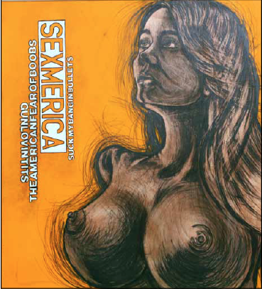
The recent work of Ralph Roether extends his usage of a cartoon style and explains how he got there, while adding a broader range of interest to the sex-obsessed content in his last wave of pictures. In correspondence with Artvoices, he cites R. Crumb, Ralph Bakshi, and John Kricfalusi as cartoonists whose work influences his own. The blatant eroticism in his Sexmerica series is reminiscent of the ribald subjects in Crumb and Bakshi, but his deft blending of provocative advertising-type copy (“gunlovintits” and “theAmericanfearofboobs”) with jiggly images uses those overripe breasts and bullet-like nipples to present an opinion not gorged with testosterone: America embraces gun culture but represses sexuality.
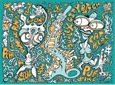
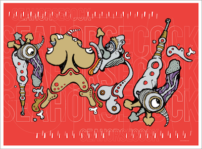
Roether warrants the influence on his paintings of Ren and Stimpy creator John Kricfalusi, whose hilarious animation of a dog and cat living together had an infantile pre-sexuality about them and a second-grader’s fascination with scatology. Roether’s Seahorsecock began as ink on paper and was converted digitally and colorized in Adobe Illustrator. Professing that the finished result comes from a technology-reliant process recalls the production studio where television cartoons are made. The art producer deconstructs biological entities into dislocated parts, bloodshot eyeballs, balloon-like breasts, and mindless penises. Kricfalusi’s work had the same post-rational metonymies writhing in an Apocalyptic background, with advertising and the sit-com form as its enervated setting. Who can forget, “It’s Log, it’s Log! It’s big, it’s heavy, it’s wood!”? Roether communicates the same Ren and Stimpy feeling that commercial slogans have replaced what previous generations accepted as real.
No exterior point of reference helps us to negotiate the world of commercial excesses clamoring for our attention or the billions of souls hoping to survive the final cut on American Idol. In a Nature that can only be understood subjectively, one last comfort is finding out the history that led to some other human sharing our space and sidling up to the trough. Roether rates Salvador Dali as an artist he admires,  but it hardly seems relevant to his work that Dali could melt watches or grow hair on a rock. The big, waxed mustache paired an academic mastery of oil paint with an intensely idiosyncratic vocabulary of forms. Skip the Freudian analysis. That giant hand certainly “represents” masturbation, but it’s Dali’s audacity in claiming space in the gallery for his feverishly personal vision that commands our attention.
Roether’s work relies for style on the graphic art of advertising and illustration, embracing commercial methods while expressing his highly individual obsessions, with pro wrestling, with typography, or with generous breasts. Experience throws new people arbitrarily into our individual consciousness on a daily basis. So much as the ceaseless accidents of existence make us anxious, taking the effort to map out how that artist or schoolyard shooter got that way re-establishes a sense of control. Roether’s self-portraits or portraits of children utilize an abstracted likeness, rendered with a cartoonish refinement of the crucial details plus a multi-layered white noise of random numbers and particular fonts.
Recognizing that Picasso and Jasper Johns used lettering as a subject reassures us that, yes by golly, Roether’s work, though it’s the damnedest thing, all those nekkid ladies and such, comes from a very long lineage. Setting such comforts aside, a thing about numerals and typography is that the individual signs, divorced from a larger context, lack correspondence to complete sentences. Be that as it may, every font communicates a mood that comes from the history of its use. Even when not used to fully form ideas they contain meaning. Roether’s use of numbers and letters as part of the composition refers to the endless, shrill pitch of advertising and how the deluge of claims on our attention, that incessant, hissing backdrop, eventually strips the signs from the products they represent.
The details about the physical means by which the images are produced are important. We long to see the process that leads from the man to the picture. His recent Blue Portrait series, self-portraits, and portraits of buxom Jenny Roether are painted on hollow-core doors. It’s a cheap material and one that might be salvaged in bulk from a home-remodeling site. Like Toulouse-Lautrec’s oils on cardboard, the thriftiness and accessibility of the surface matters, but the non-absorbency of the surface recommends it for the artist’s style of colorization and the ease with which transparency is achieved.
Roether writes that the documentary Crumb “opened my eyes to a whole other art world. [It] had a huge influence on me.” Terry Zwigoff’s film pleased many of us, perhaps because of Crumb’s candor about his own peculiar sexual obsessions and openness about the influence of his comic book-loving older brother, a fine artist who was mentally unfit to put his work before the public. Best of all, the movie has no less a critic than Robert Hughes to tell us that satirical cartoons exposing society’s underbelly are more than worthy of claims to high art. We benefit by recognizing that the over-the-top sensibilities of the satirist, looking in instead of out for some of his most extreme characterizations, have their origins in advertisements, pop culture, and between the matches at Wrestlemania.